Oracle Primavera 8.2 was recently released in late 2011. The release for didn’t make a huge splash as there wasn’t much new announced for P6 Professional, the windows-based version of Primavera most users are still clinging to (although Oracle would love to see them on Web Access). I suspect adoption of Primavera 8.x among most companies has been slow. With very few pm enticements in recent versions, the thrill to upgrade for P6 Professional addicts is just not there.
For background on the different versions of Primavera P6 Professional check out our P6 latest version page for a full history of releases.
But I think many users are missing out on a game changer in P6 Professional 8.1 / 8.2 that makes using Primavera much easier, saves loads of clicks and affords great screen management. Let me elaborate on four user interface items specifically, highlighting what works and what still needs improving. We`ll start with the least dazzling first.
1) Customize Your Toolbars – Less Time Clicking in Menus Means More Time Planning
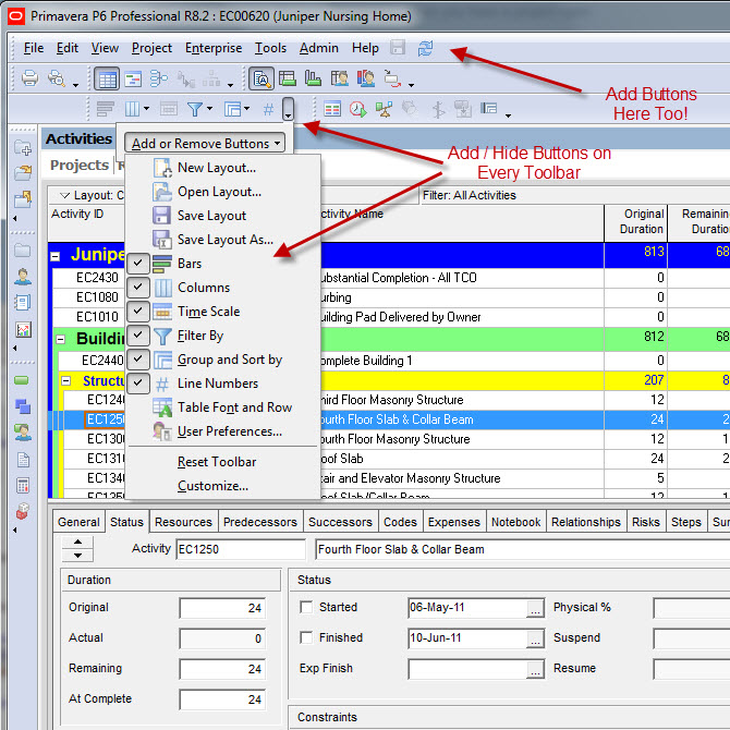
As of P6 8.1 users can now adjust, move and totally customize Primavera’s toolbars anyway they like. Want to hide buttons and features you never use? Now you can, even in the menus! Rearranging the toolbar positions to your liking will save you time searching and pecking for your most used features in the menus. Most important is the “Add and Remove” buttons feature, common to most windows apps these days. Create and dock your own custom toolbars adorned with your favourite buttons. No more digging in the menus to bring up the “Activity Codes” or “User Preferences” screens. Just add them to a toolbar and it’s one-click access from now on! Finally!
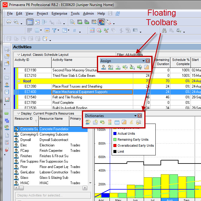
Toolbars can also be undocked and floated over your work screen. Drag them anywhere you want them. There’s also a feature to “Lock Toolbars” once you’ve got them positioned just the way you like them – even the floated toolbars become locked in place. Also handy is the ability to reset the toolbars back to the default layout if you’ve messed them up too much.
Thinks this is good? Wait…… there’s more coming.
Although these improvements should save you about 10,000 clicks / year, Oracle doesn’t quite get full marks in my opinion. What’s missing is the ability to place specific activity layouts as buttons on toolbars. Imagine the ability to flip between two or three of your most loved activity layouts with a single click! Come on Oracle! Where’s the love? We NEED this!
2) Tabbed Screens – Friendly and Browser-like!
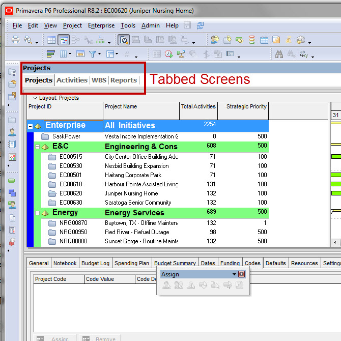
Tabbed screens in Primavera let’s you open multiple P6 screens in the same window just like in your internet browser. You can switch between screens by clicking the tab you want to view. What I like about this is that the tabs act as an audit trail, so you can see what screens you’ve recently visited. This makes a huge difference in the way people navigate inside Primavera. With tabs, there’s much less clicking to find the data you’re looking for. I like that Primavera’s interface is finally adopting features from this decade rather than sticking to it’s original and clunky interface from the 90’s.
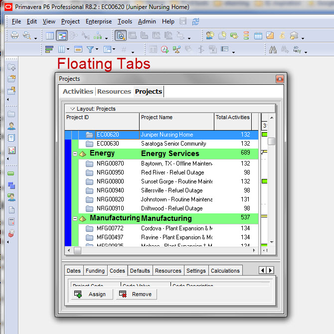
3) Floating Windows – Nice But Still a Bit Buggy
While tabbed screens are great on their own, there’s more. Each tab also acts like a window as well. You can now undock a tab, float it over your work area and resize it like it’s a window. Well….. in theory anyway. Performing the right click and drag maneuver to get a tab to undock is near impossible! The whole thing involves too much fiddling to be working correctly – so it’s probably not. Also, if you do manage to undock and float a tab, whenever I try to move it, it wants to redock instantly leaving me feeling like I’m wrestling a mazola gorilla. The whole exercise becomes annoying fast.
While I can see a lot of potential use out of floating, say, the Resources screen, the process to get it to float is still buggy. Still some work to do here Oracle.
4) Tabbed Groups – the GAME CHANGER!
Primavera has ushered in a paradigm shift in useability with the launch of Tabbed Groups. Tabbed Groups give you the ability to tile your screens by creating horizontal or vertical tab groups. You can now tile and layout multiple screens, adjusting them exactly how you want them by creating Tabbed Groups. For example, you can tile the WBS screen alongside the Activities screen so they are both showing simultaneously. Drag the dividers to make a tile bigger or smaller.
Having the ability to tile and display multiple Primavera screens (and data groups) at the same time will change how most folks use this tool. And once you figure out that you can drag resources from the Resources screen and drop them on Activities to assign work, you’ll start to instantly love Tabbed Groups.
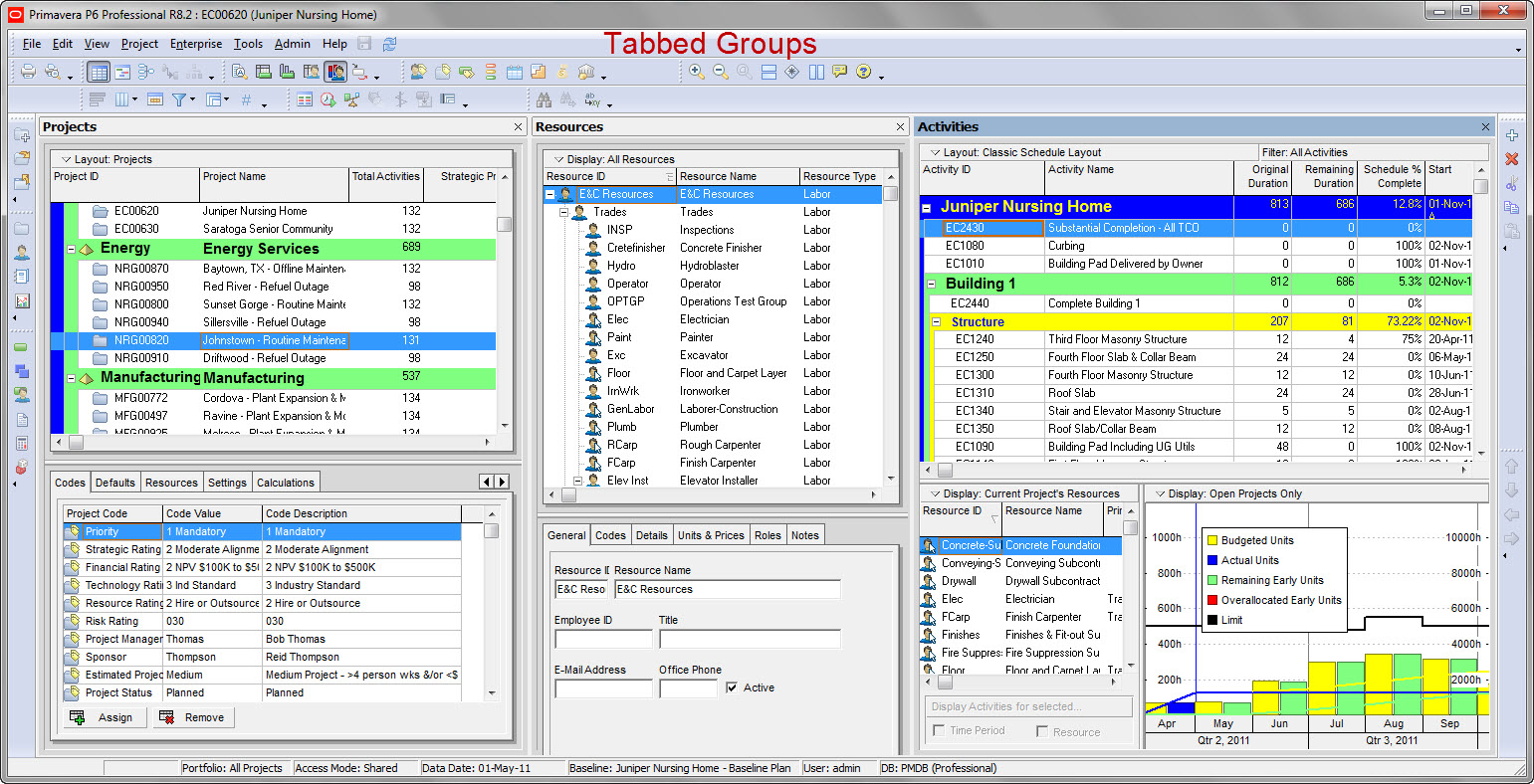
This also becomes a huge boon for all of you using multiple monitors. You can now set different tabbed groups to show on each monitor…and they will stick! Prior to P6 8.1, using multiple monitors wasn’t that great because you didn’t have the proper screen control. Now you could set the Resource dictionary to show on the left monitor and it will stay there even as you switch between screens or tabs on the right monitor. The new flexibility this affords users is invaluable to being a more productive, less clicky P6 user.
Wrap-up:
Many Oracle Primavera P6 Professional users seemed disappointed by the P6 8.x releases. True, Oracle needs to pick up some slack with regard to improvements in the planning / scheduling features of P6. However, there is still some goodness in 8.x with a totally revamped user interface that will save planners time and make the tool more intuitive to use.
If you’re a P6 8.x user, it’s your turn to make the call. What do you like / don’t like in the new interface? Leave a comment and let others know what you think.


