Let’s talk about some of the most important new features in Primavera P6 version 22.12 that just dropped.
There are quite a few new features between v.22.12 and the previous version 21.12. I want to show you some of the cool new features and one or two that I’m really impressed with and a couple that disappointed me.
1. Added Baseline Fields
The first new feature in Primavera P6 version 22.12 I want to talk to you about has to do with Baselines.
They’ve added some additional Baseline fields when you’re picking the baseline. When I pick a baseline. I now have, instead of the dropdown list, a wider view and I’m able to pick some columns like the day to date of the Baseline, the Planned Start, the last recalculate date, and you can customize these columns as well.
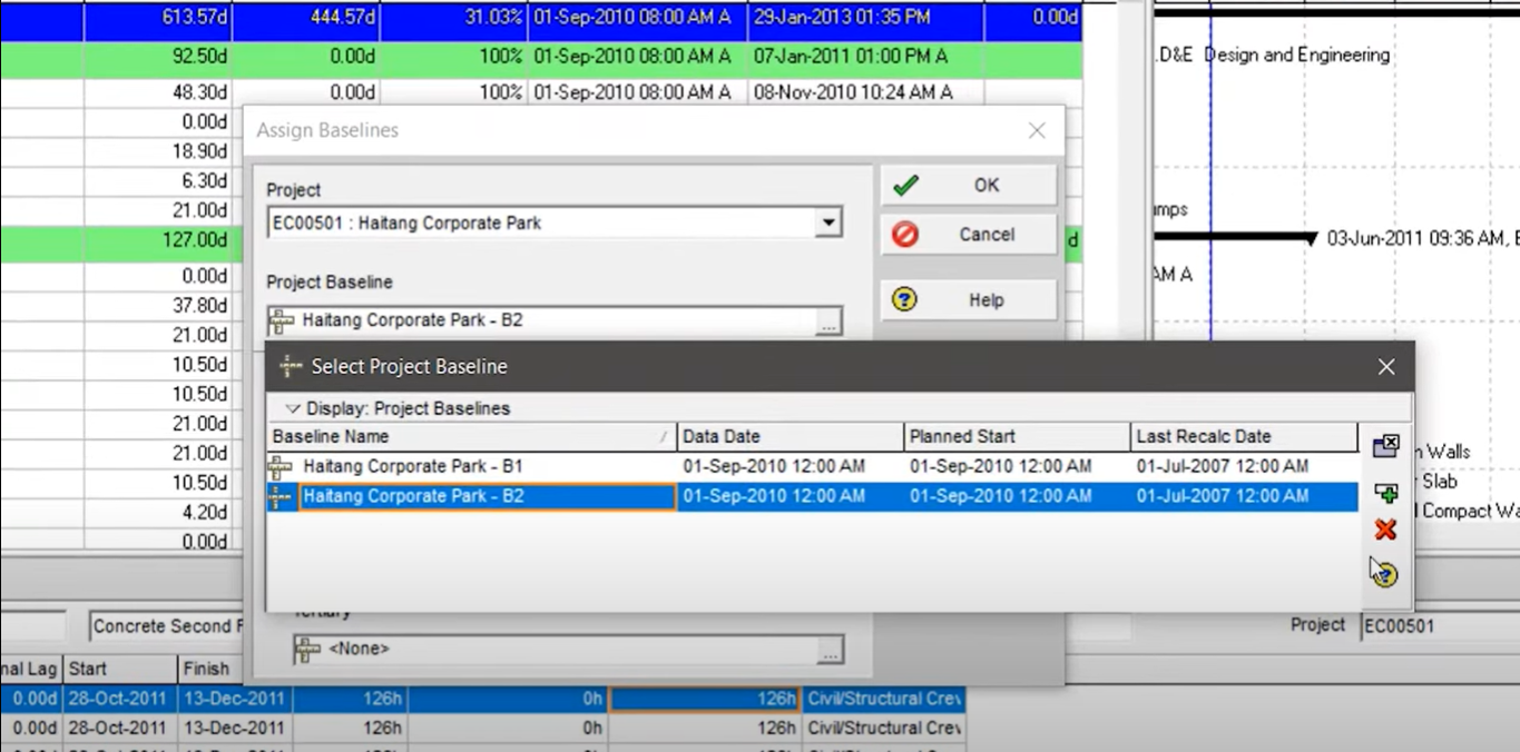
This really isn’t going to change my world too much because I think we put lots of information in the description. We’re not used to having these fields, so we’ve actually put them in the description. I think we’ll use it, but it’s not that exciting.
2. New Earned Value Fields
The next one has to do with Earned Value. What we’ve got now is an additional field at the resource level for tracking Earned Value. Prior, we only had fields at the Activity level for tracking Earned Value information like Earned Value, Planned Value, whatnot. But now we’re able to find additional fields. Let’s check them out.
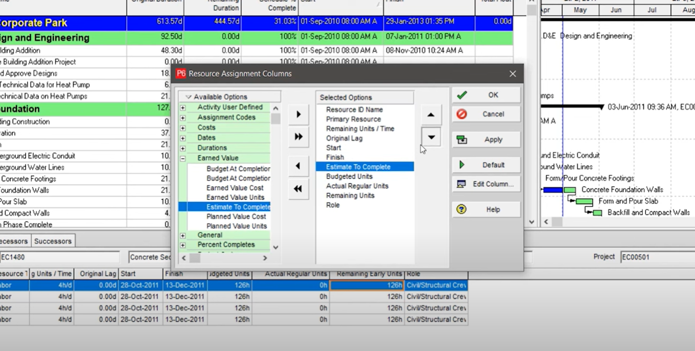
If I open column chooser, they added Earned Value fields at the Resource level. I can now put in my Estimate to complete at the Resource level.
Now it makes me wonder were these fields always there and are only now being surfaced? Or is there some additional information that’s being calculated down at the Resource level?
I know that many people like to calculate crew information for Earned Value at the Resource level, so this is going to help you a lot. You’re going to like this.
3. Export in IPMDAR Format
The IPMDAR format is used a lot in military and other kinds of government contracts. This format now has some wider support in P6. It used to be that we could only get projects exported into that format if we were connected to an EPPM database. Now we can actually export projects to that format if we’re connected to a regular P6 professional database or even a standalone SQLite database.
This is stuff that I think could have been there a long time ago, so I’m happy to see it now in these new Primavera P6 features.
4. DCMA Schedule Check
So this one, I’m pretty excited about the DCMA 14-point schedule check that has now been added into P6 PPM. That’s right. We had it, I believe in EPPM, but it was missing. So now we’ve got it. Let’s check it out.
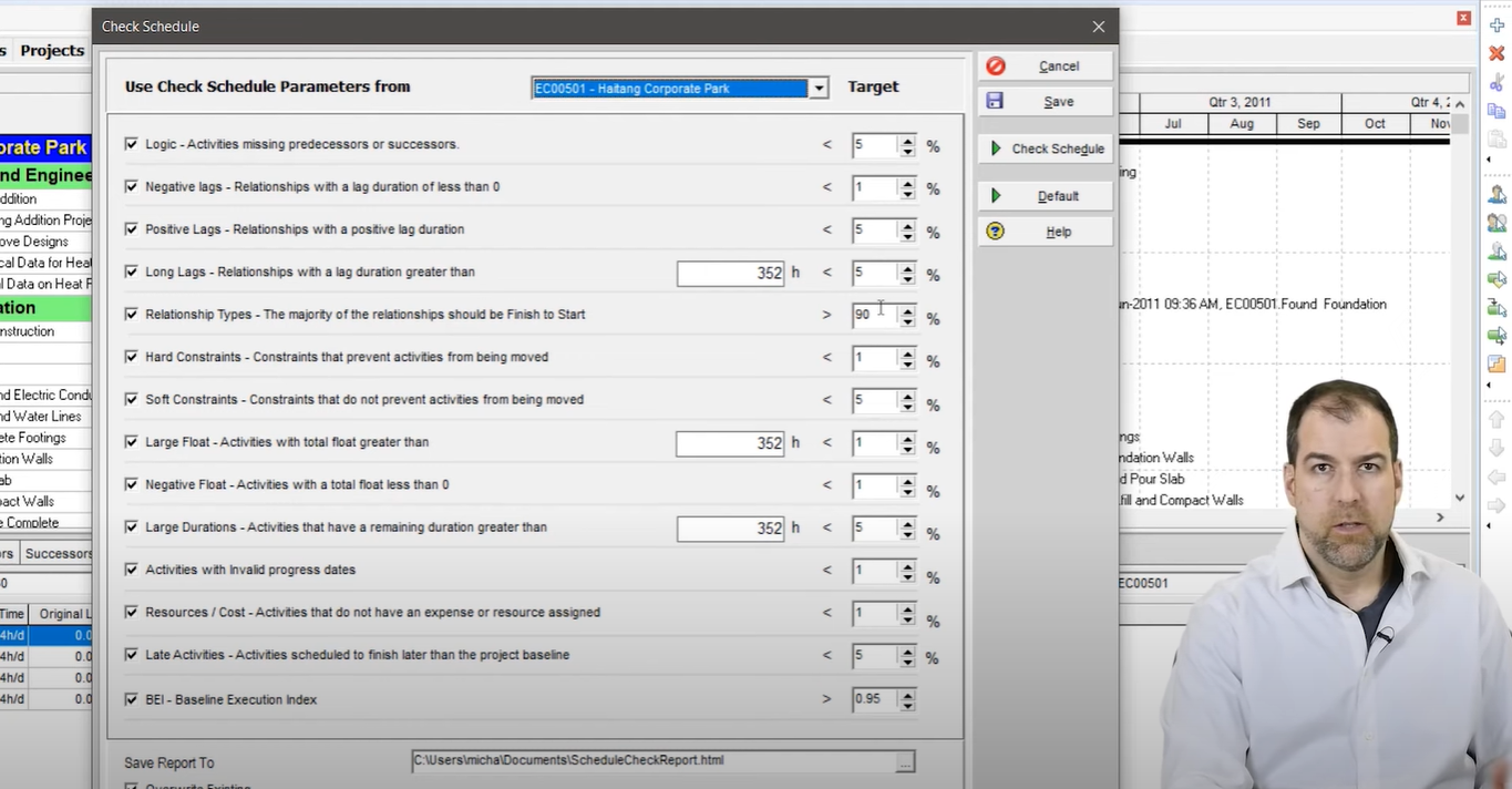
So if you want to run the DCMA scheduled check, you can go to tools and just check the schedule report. Here we go. We have now a pretty flexible check schedule screen we can configure, pick the ones we want, adjust the targets. A lot of this is what we’ve seen in other applications in other places and then if we want to check it, we can just click the check schedule and get a report.
It’s pretty extensive and it kind of looks like one of those standard P6 reports that comes out with the listing. One of the challenges for me with this report is the HTML format. This is a classic P6 HTML report that is a bit challenging to use, although, I’m glad to see the color coding is here. That’s an improvement.
Why not an Excel report? Why not crank this out to excel like Deltek Acumen Fuse? This is the kind of stuff that’s holding us back. We need some better reporting out of P6 and man, am I glad they put in a DCMA 14-point analysis check. We’ve needed that for years and we’ve had to go to other tools for it.
But now that it’s there, if I’m already invested in other tools that do it better, I might stick with that.
5. Copy Paste Resources
Another enhancement has to do with the Resource Assignment screen, which is one of my favorite screens. We now have Copy and Paste on the Resource Assignments screen. Let me show you how that works now.
Okay. So I’m on the Resource Assignment screen and have a look. I can now highlight this data on the right hand side of my screen. And if you right click, check out what we’ve got. We’ve got a couple of options here. We’ve got a Fill Across option. I haven’t come across it before, so that’s new. And then we have this Range Copy and Range Paste and we can paste the data across.
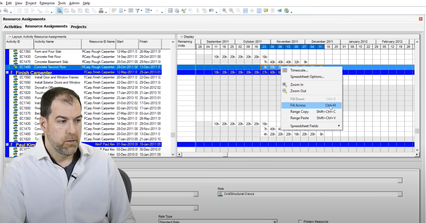
So for those of you who work heavily in forecasting your labor, all of that stuff is done here in a Resource Assignment screen. We now have some additional flexibility here, which is really cool.
The one thing I’m struggling with again is there’s no undo. So if I paste something, I can undo it. And how do I remove something I pasted?
How do I remove it? If you want to delete the Resource Assignment, that’s going to kill the whole line. Instead, I actually have to go and zero out each cell one by one. So Oracle, keep at it. Keep trying, guys. You’re going to get it. You’re going to get it.
6. Side By Side Comparison
So this option brings me a lot of joy.
So two years ago, I made a video where I talked about this exact problem. It’s possible they actually saw this video and implemented it. We have not been able to do side by side project comparisons in P6 ever. It’s just not been possible. But it is now.
Let me show you how it works now. So, we have a new option if we go to the Project Menu and choose Additional Activities View, we now get a second tab and it’s still the same project but in a different tab. And what I can do is I can have a different layout. So as you can see I’ve got Earned Value here and I have a classic schedule layout.
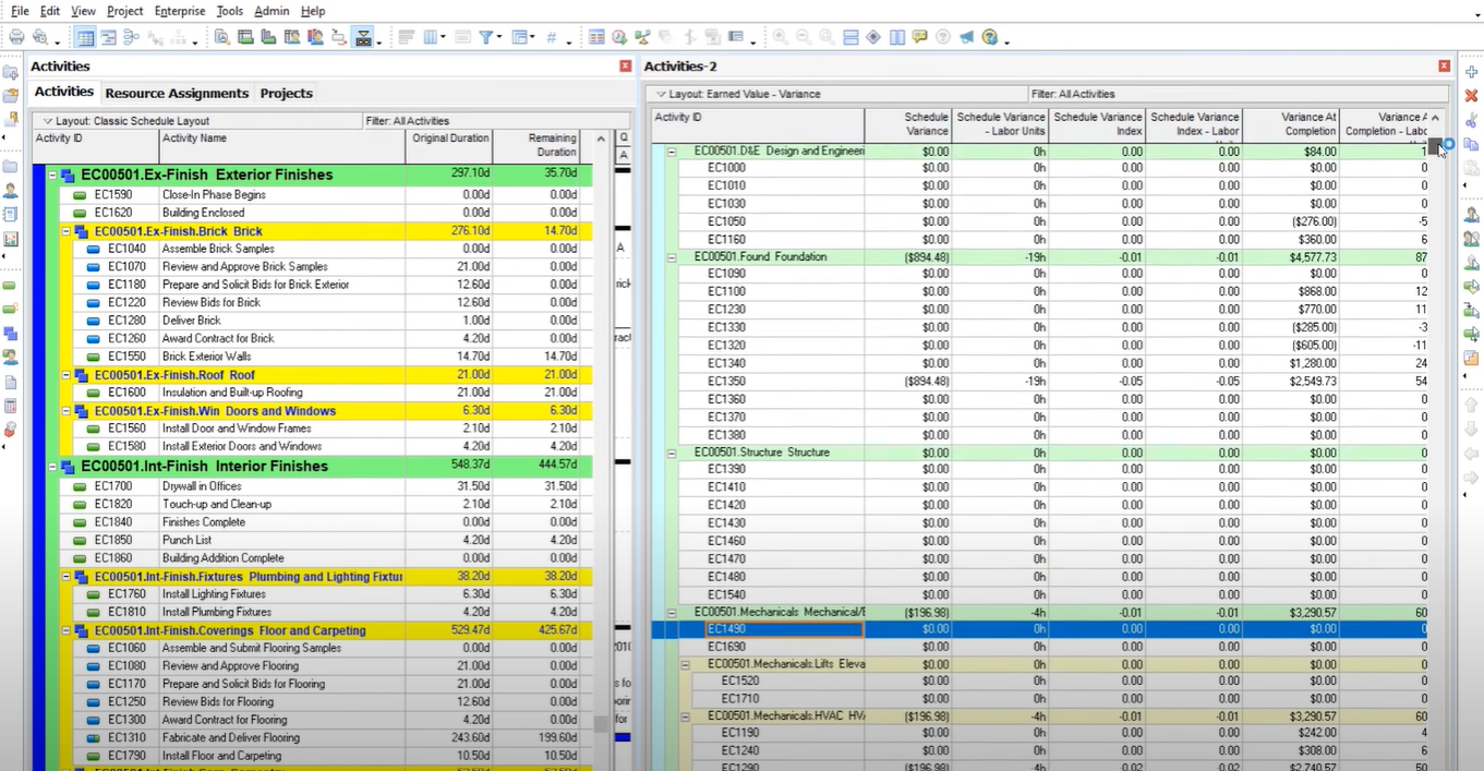
Of the new features in Primavera P6 version 22.12, this one has been around for a long time, but I can now divide my screen in to check it out. You can use this horizontal tab group or you can go to the View menu and use Tab Groups. And so now we can actually compare two projects or the same project, different parts of them, side by side.
If you wanted to compare two projects, you would open both at the same time and you would scroll to one in the top and the second project at the bottom and compare them side to side. Now I used a top-to-bottom layout in this video. If we want to do side-to-side, we can also do that and have independent scrolling so that these two screens don’t scroll together.
That was a problem in previous iterations where you could show things like this, but they would both scroll together and you couldn’t really compare when they scroll together. So now they’re independent and we are now able to compare two projects visually side by side. This is very basic. We’ve had to do so many workarounds to get here, like using Schedule Reader, which is what I advocated for before.
But now it is built in with this version 22.12. So yeah, this is going to improve our lives in a lot of ways.
Final Thoughts
I’m thrilled to see that we’re making improvements to P6. I didn’t get the chance to cover all the new features in Primavera P6 version 22.12 in this post – like importing and exporting .xml files. But, these updates change the game for me and I think they are going to make your life a lot easier.
If you want to find out about all the new features in Primavera P6 version 22.12, they’ve also added them to the Help menu. So if you go to Help > What’s New this should load up the P6 cumulative feature overview tool where you can actually compare your current release to a previous release, and run a report that lists all of the enhancements. It is now right at our fingertips on the menu.
Let me know which new features you found useful in the comments below!

